Before I started this course I think I appreciated a nice photograph but without actually realising what made it a nice photograph. Certainly the Elements Of Design section has been a real eye opener. I find myself looking at things differently, trying to make something out of seemingly innocuous subjects. It is clear that a lot more work goes into photography than I'd imagined. As I reached the end of this section I made a visit to the Street Photography exhibition at The Museum of London. Three or four of the images stand out for me with regard to design.
"Recruiting Sergeants at Westminster" c.1877 by Josh Thompson makes great use of a horizontal line in composition as well as including three fantastic eye lines.
"Hookey Alf of Whitechapel" by Josh Thomson could have been just a regular group portrait had it not been for the little girl accidentally walking into the frame. While the rest of the group continued to stare at the lens, Hookey Alf himself cast the young girl a downward glance, making the picture. Mr Thomson took a great shot.
"Children swinging on a lamp post Lambeth 1893" by Paul Martin strikes me as one of those images that works perfectly well with the subject matter placed firmly in the centre of the frame. The ropes and the children themselves do add a sense of symmetry.
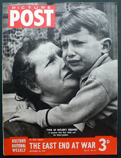
Bert Hardy's iconic picture, "East End Child 28 September 1940" is a very powerful image of the time. Whilst the child's foster Mother is the largest element and placed closest to the centre of the frame, the composition is still dominated by the tearful child looking for comfort after a bombing raid.
"Petticoat Lane Market, Shoreditch 1952" by Henry Grant is actually my favourite image at the exhibition. The timeless expression on the vendors face, matched only by that brilliant eye line of the woman glancing at the puppies as she walks past. I wonder if she bought one?


No comments:
Post a Comment