Exercise : Control the strength of a colour.
For this exercise I went to the local postbox being the most obvious single colour object within a reasonable walking distance. I took the five shots at late afternoon to try to capture the most accurate colour rendition. All the shots were taken at iso200 with a shutter speed of 1/640th of a second.
 |
| Picture 1 |
Picture 1 was overexposed by a full stop at f4. The red object appears more orange in this instance, in fact the half which is further away from the direction of the light has taken on more of a pink hue.
 |
| Picture 2 |
Picture 2 is overexposed by half a stop. Still the red colour appears "washed out", although the extreme left side of the frame, furthest away from the direct source of the light, has taken on more of a red tone.
 |
| Picture 3 |
Picture 3 is that which the camera indicated as the correct exposure at f5.6. The colour, while still not entirely true is certainly more indicative of the pillar box red.
 | |
| Picture 4 |
Picture 4 has been underexposed by half a stop at f 6.3. The result is a much deeper red hue and probably the most realistic of the set.
 |
| Picture 5 |
Picture 5, a full stop underexposed image now appears to show the left hand side of the frame becoming very dark. The red colour in this image is certainly the deepest hue, but not an accurate representation of the actual colour of the subject. Limiting the amount of light coming through to the sensor has had the effect of darkening the colour.
Building A Library Of Colours.
Exercise : Primary and secondary colours.
Finding scenes dominated by a combination of a primary and secondary colour wasn't as easy as I expected.
 | |
| Dandelion 1 f18 |
 |
| Dandelion 2 f20 |
In the series of dandelion pictures three shots were taken at a shutter speed of 1/60th of a second. Apertures of f16, f18 and f20 were used. In this instance, Dandelion 2 at f18 probably represents the most accurate colours of primary (yellow) and secondary (green) when referring to the standard colour circle.
 |
| Dandelion 3 f16 |
 |
| Worker 1 f3.2 |
 |
| Worker 2 f4.0 |
In the "Worker" sequence of shots we see a man studying a wall chart. The primary colour of Blue is contrasted strongly against the secondary colour Orange vest being worn. All shots were taken using a shutter speed of 1/40th of a second using available light. Again, it would appear that the middle exposure, "Worker 2" (f4.0) best represents the colours on the standard colour circle.
 |
| Worker 3 f4.5 |
 |
| Bike 1 f4.5 |
 |
| Bike 2 f5.6 |
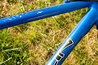
In the sequence of pictures entitled "Bike" all three shots were taken at 1/320th of a second. In this instance I believe the picture taken at the narrowest aperture "Bike 3" f6.3 has rendered the colours at their most accurate. This may well have been due to the intensity of the light at the time.
 |
| Bike 3 f6.3 |
 |
| Asian Flower 1 f5.6 |
 |
| Asian Flower 2 f6.3 |
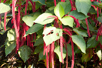
In the "Asian Flower" sequence the lighting has made things a little tricky. The combination of highlights and shadows has thrown the metering out a little. In the finla shot "Asian Flower 3" I would say the reds have been rendered most accurately. It is difficult to pick a decent green out from these poor efforts.
 |
| Asian Flower 3 f8.0 |
 | |
| Palm 1 f4.5 |
 |
| Palm 2 f5.6 |
In the three shots entitled "Palm" I have again selected a tricky lighting situation. Grrrr. In this sequence the Blue colour is rendered best in shot "Palm 3" at f6.3. However, I think the Green is more accurately reproduced in "Palm 2", shot at f5.6.
 |
| Palm 3 f6.3 |
 |
| Yellow Flower 1 f4.5 |
 |
| Yellow Flower 2 f5.6 |
In the sequence entitled Yellow Flower, all shot at 1/80th of a second the most accurate Yellow is achieved in the 1st shot taken at f4.5. The green leaves of this plant are a little too dark to be honest. I seem to have developed a habit of choosing poorly lit scenes.
 |
| Yellow Flower 3 f6.3 |
Colour Relationships.
To retain a natural balance between the colours in an image the relative brightness of each colour must be considered. As red and green are equally bright then they may occupy a similar amount of the space within the image in order to achieve a sense of harmony. The ratio between orange and blue would be 1:2 as orange is approximately twice as bright as blue. For yellow and violet the ratio is nearer to 1:3
 |
| Image 1. Yellow/Violet (1:3) |
In image 1 I have tried to keep the predominant colours in ratio, that is 3 parts of violet to 1 part of yellow. Having experimented with this a little it became clear that any more yellow in the frame resulted in that colour becoming very dominant, therefore upsetting the balance of the image.
 |
| Image 2. Orange/Blue (1:2) |
Photographing a map for Image 2, I kept the proportions to approximately 2 to 1 in favour of blue over orange which has resulted in a nice balance.
Image 3 demonstrates an ideal balance between red and green at a ration of 1:1.  |
| Image 3 Red/Green (1:1) |
Exercise : Colour relationships.
Warm and Cool colours.
I find it quite odd how we naturally attribute warm or cool to certain colours. They obviously aren't PHYSICALLY warmer or cooler, but certainly they instill those feelings within us when viewed. I always had more of a leaning towards cooler colours I guess, finding them more clinical and refreshing. I have two pictures that I took on a holiday recently. They were taken at opposite ends of the same day. the first is a picture of the sunrise at Angkor Wat. It's a definitive tourists box ticker shot, but I couldn't go all the way there and not capture it!
It is pretty much black and blue and sums up the feeling of "cool" quite well I think.
Towards the end of that day we took a boat trip on Tonle Sap in search of an exhilirating sunset that just didn't happen. But as this boat passed by I quickly lifted my camera and snapped a consolation prize.
The complete antithesis of the previous shot, this one is about as warm an image as you could get.
Black and White.
Exercise : Colours into tones in black-and-white.
Following the guide in the coursework folder I made a similar composition, including a grey card.
 |
| Picture 1 |
Picture 1 is the original image in full colour.
 |
| Picture 2 |
Picture 2 has been converted to black and white without the use of filters.
 |
| Picture 3 |
Picture three demonstrates the effect of raising the red slider in photoshop effectively applying a red filter to the image. The red part of the original image has now been lightened considerably.
 |
| Picture 4 |
For picture 4 I replaced the red slider and moved the yellow. Similarly to picture 3, this has had the effect of making the yellow part of the image appear really bright. The blue background has also been darkened somewhat.
 |
| Picture 5 |
In picture 5 the green slider has been applied. This has lightened the green part of the image, though not to the same extent as the red and yellow in the previous images. I think I used the wrong type of green!
 |
| Picture 6 |
Picture 6 is a clear demonstration of the application of a blue filter, or moving the blue slider. The blue background colour appears completely washed out.
A surprising amount of tonal control has been achieved here. I have started using it as part of my everyday photographic activities already.


No comments:
Post a Comment