Friday, 11 January 2013

Assignment 5 : Applying the techniques of illustration and narrative

I made a few visits to The Bluebell Railway in Sussex for the purpose of this exercise. It is a heritage railway run entirely by volunteers offering trips along a short section of closed line to members of the paying public. An incredible amount of work goes in to keeping this railway running, much of it behind the scenes before the stations are even open for business.

Cover Shot
Southern 1638 emerges from
Sharpthorne Tunnel in Sussex 


I selected this image as my cover shot. It shows the train emerging from the darkness of a tunnel into the morning sunlight. The age of steam is not dead. There is plenty of room within the image to add the cover text as may be required.


Image 1
Early morning autumn sunlight bathes the yard as the railway springs into life

Work starts early getting the trains prepared and ready for service. Image 1 shows the yard at this time of day with many people keeping themselves busy.


Image 2
Filling the tender with coal.
Train cleaners look on from another locomotive


Image 2 shows plenty of activity in getting the trains ready for service. The green train is having the tender loaded up with coal. Meanwhile two men are busy giving the blue train a clean and polish.


Image 3
Hot, thirsty work. The unenviable lot of the fireman

Image 3 shows the unenviable lot of the fireman. Of course no self respecting railway could run without the prerequisite brew cans!
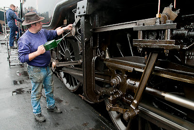


Image 4
The authenticity of the railway even stretches to the oil cans

Image 4 and Image 5 would appear on the same page or pair of pages. Without the first image there could not be a second. Preparation and painstaking attention to detail are essential to keep these old machines running smoothly. The olde worlde oil can being used just looks so right in this image. After much preparation the train is ready to run and offers a sight that many people never tire of seeing.

Image 5
The glory of steam! Southern 1638 at speed

Of course all this hard work is aimed at one thing. To give a pleasurable experience to people, especially the many children who come to visit with their parents (Image 6). These paying passengers provide the much needed funds to keep the railway running of course and it is clear to see they seem to be getting value for money!

Image 6
A prospective future driver enjoying the day!


ASSIGNMENT FEEDBACK


Overall Comments

Thanks for sending me what I believe to be your best assignment so far. I see you have now posted the images and text on your blog; as usual the layout and captioning is excellent. The standard of the photography is consistent across the whole set, in fact each image makes a statement in its own right. Together they convey a comprehensive impression of the railway, its volunteers and visitors, in only six images.

For assignment four’s feedback I gave you tips on how to tackle this assignment, as well as the usual, more general feedback. You have responded by combining all of my advice with the knowledge and techniques that you have learnt during the module: concepts, composition, colour, lighting and finally narrative.


Feedback on assignment

This was a technically demanding assignment. Strong, low autumn light looks great when handled correctly, but it can be difficult to balance high contrast, especially when black locos and white steam are added to the equation. The first two images use backlighting well to show the steam and reflections on tracks. The only overcast shot was used to render the reflective, oily metalwork of the engine with subtlety. The harsh sunlight on a light shirt and black engine in image 3 have both retained detail, as well as the flames in the firebox.

Your exposures are well controlled throughout; even image 5, which was a difficult balancing act. The shutter speed chosen in that shot has rendered details sharp on the loco, yet also shows motion blur on the wheels, giving a sense of speed.The composition and framing of this assignment are a real improvement on the first four. Most images employ a clear focal point, or a clear arrangement of several (e.g. implied triangles in 2 and 6). Most images also use diagonal lines to draw the eye into the frame (e.g. 1, 3, 4 and 5).

Your editing and sequencing also impress me. The opening shot is simple, striking and (as you point out) ideally suited to overlay with text. Image two is the story telling image to start with, showing the wider view, two locos, tracks, volunteers and scenery; it illustrates the context of the location. The next three show the teamwork of the volunteers, all nicely composed and without any distractions. Finally, taking a step back from the action, photographing the photographer, highlights the visitor experience. This gives an idea of the railway’s engagement with the public, generating funding for the railway’s continuation, as well as inspiring future generations to get involved.

In total, the set gives a well-rounded impression of the railway including context, action, portraits, close-ups and the visitors. I’d suggest editing the captions with the images for assessment, with the sort of narrative style captions you might expect to see in a magazine or an exhibition for the railway; just a sentence or two is enough.

At the moment the captions are good for the assignment as it is sent to me, but this assignment needs an overall look and feel as if it’s ready for the outside world. For example, image one starts and ends with messages for me (perhaps), but not messages that you’d put in a magazine.


Learning Logs or Blogs

As per my comments last time, I can see in your blogadequate reflections on your own work.For assessment, you will need to show more evidence of viewing other photographers’ work, in books, online or at exhibitions. The learning log accounts for 20% of the marks at assessment, so it’s worth adding all the reflection that you can on what you have experienced throughout the module, as this is an important part of the log.


Suggested reading/viewing

I recommend reading100 Ideas that Changed Photography by Mary Warner. Also, look on the webthe photography of William Klein; a great photographer of people. You may notice one of his most famous images has a similar look to your self-portrait with pistol. For rail shots, particularly those in the greater context, take a look at the images of O. Winston Link if you don’t know his work already. He often used great banks of flash heads that must surely have been a hazard to the train drivers, but allowed spectacular night photography.


Pointers for the next assignment
Module completed.


Tutor name:
Derek Trillo
Date
18January 2013
Next assignment due
Module completed

Thursday, 4 October 2012

Narrative and Illustration

Putting the subject first.

I have often thought of my photography as having little in the way of direction. I mentioned this to my tutor with my introduction. His reply was that I like to take pictures of things that interest me. That of course is very true and is in itself a form of direction. I always strive to make the best image that I can of whatever it is I happen to be recording. Often I end up disappointed, other times pleasantly surprised. But what of the rare instances in which it isn't really feasible to make a technically faultless photograph when faced with a moment that may not come again?

Picture 1
Picture 1, the jelly babies is my own most perfect example of treatment over subject. I went to a great deal of trouble to find the correct surface on which to place the subject, then spent a long time pondering the lighting and composition, to say nothing of getting the colours right. The point of focus and depth of field complement each other perfectly. So it is a technically sound image, at least in my own eyes. But at the end of the day it's just jelly babies!

Picture 2
I went almost literally to the end of the world for Picture 2. This was a big deal for me, seeing a critically endangered Kiwi in the wild. It was night obviously but it was also raining, and quite windy too. With just torchlight illuminating the subject from a short distance I decided to try and capture the moment. Even at iso2000 and f1.4 I couldn't get a shutter speed to freeze the birds movement. Why won't these things stand still?  But of course I had to have an image of a most wonderful experience. For me this is a perfect example of subject outweighing the need to produce a graphically flawless image.


Exercise : A Narrative Picture Essay

For this exercise I selected a subject with which I am quite familiar, concert photography. I'm not too familiar with the band portrayed so I couldn't get any "behind the scenes" shots unfortunately. I did get myself into position before the performance started however and was able to obtain "before" and "after" shots of the stage props which give a good idea of how the evening proceeded.

The Dogbones bring dolls on stage with them.

Image 1


Image 2


Images 1 and 2 portray the dolls in positions before the show has started. The guitarists instrument is in place and one of the roadies is preparing the drum set.


The two drummers get proceedings under way. At this time they are the only people on stage.

Image 3
The other three members of the band now join in. Firstly, as depicted in image 4, the guitarist continues the intro. The bass player joins in and finally the vocalist swings into action (image 5).


Image 4


Image 5


With the guitarist and vocalist demanding centre stage (Images 6 and 7) the band grind through their set.

Image 6


Image 7


As the show progresses the band feeds off the atmosphere being created by an energetic audience. The dolls, initially considered to be nothing more than oddly decorative stage props now play their part in an increasingly vibrant spectacle. In image 8 the vocalist is seen performing a dance with one of them.


Image 8


You can now feel the raw energy being created by the band. The dolls, and the wig,  are tossed aside as the vocalist rips into the final song. She leaves the stage followed by the bass player. The guitarist is next having thrown his resonating instrument on to the drums, leaving the two drummers to play out the gig in a similar fashion to the opening, as seen in image 9.


Image 9

The final image focuses firmly on the aftermath. The mic, wig and dolls have been nonchalantly discarded by the side of the stage. I know they are inanimate objects but to me, the dolls appear exhausted!

Image 10


Exercise : Evidence of action

Trying to avoid the obvious accident aftermath type of shot I thought about the environment around me at the tail end of this year. I decided to head for Croydon, the most convenient main shopping centre and a town in turmoil from recent riots and the economic downturn. In 2012 Allders department store celebrated it's 150th year of trading in the town. Sadly it was also to be it's last. The store went into administration in June and finally closed it's doors on 22nd September. I would estimate around 70% of the contents of my home were purchased in that once proud store. The image I have selected for this exercise shows the "Notice of administration" which was posted in the windows of the store. In the background it has become clear that no buyer was found during the period of administration. The floor is empty, shutters are down and a lonely till point stands silent. Of course this is not a simple case of a single store closing down. All over the country, indeed most of the world, the current economic woes combined with the trend for shopping online are hitting the retail sector very hard. So this image shows evidence of an action that has occurred here at a local level, but which continues apparently unabated at a national and global level too.

Evidence of action


Exercise : Symbols

Being able to find symbols for a number of concepts was a little trickier than I imagined, particularly as I was trying to avoid tired cliches. This isn't always possible of course but there were a couple of ideas that sprung to mind.

GROWTH.

Outgrowing one's environment is an idea that occurred to me. In a very simple form I imagined a goldfish that had grown too big for it's bowl. I made a quick sketch.

Obviously this unfortunate fish has grown far too much for the bowl in which it lives and needs a larger one. 

As another example of growth I tried to imagine a large glass jar with a few coins in it. Now thinking forward for a period of time, picture the jar almost full of coins. Next to the jar now is a mail order catalogue, opened, and an item on the page has a circle pencilled around it. Someone has saved hard and is about to reap the benefit of the growth in their savings.


EXCESS.

Excess. It's just too much. I have a vision of a person slumped forward in their chair over a table, hand still grasping an empty glass despite the fact that they are probably unconscious. At the edge of the image is an empty liquor bottle on it's side.

Of course excess doesn't necessarily mean overindulging with food or drink. This image seen frequently on various blogs or humorous e-mails speaks for itself really.


To convey a similar message I need only take a photograph of my partners luggage immediately before a holiday!

CRIME

Gun crime in the UK is quite low compared to many other countries, particularly the USA.


This is a self portrait I conjured up. I used a 105mm Macro lens and set the aperture to f2.8 to achieve this very shallow depth of field. I held the gun very close to the lens and fired the shutter remotely. In no uncertain terms all the attention is focused very much on that gun barrel.


Cathal McNaughton took an unbelievably emotional image of a boy at his brothers funeral in Northern Ireland about ten years ago. The boy is in the foreground, crying with his head in his hand. In the backgrounds the pall bearers carry his brothers coffin. The young lad had been killed in a hit and run incident. The picture tells a tale of the number of real victims of the crime. One person was killed but many more have had their lives ruined. I don't know if I could have taken that picture. But it conveys a very powerful message.


SILENCE

There is a dark room, unlit save for a solitary candle burning on a small table in the middle of the otherwise unfurnished space. I shall frame the shot so that the candle is in the centre of the frame, occupying no more than five percent of it. I will underexpose by a stop and a half so that the only items visible will be the candle and a little of the table top.

I'm trying to avoid the obvious cliche of an attractive young lady holding a finger up to her pursed lips. I'm terrible at portraits anyway! On a very recent trip I took a boat ride along some canals in Central America. At one stage, with the engine shut off and the water as still as a millpond it was perfect. I could imagine an image of a local guy lying asleep on a narrow canoe, perfectly reflected along with the jungle around him, in the totally still water. It would make a perfect image of silence. As long as it didn't come with a soundtrack of course, due to the cacophony of sound emanating from the jungle!


POVERTY

Similar to my gun self portrait above, I could imagine a shot in which the weapon is replaced by an outstretched open hand, palm pointing upwards.

I would try a portrait, perhaps young siblings no older than six or seven, from a lowest caste family in India. I wouldn't ask for any false expressions or poses. Just a natural look to demonstrate that poverty often has a smile on it's face.


Exercise : Juxtaposition


Juxtaposition

The Great Escape

The book title I selected is a well known prisoner of war tale. I have re-interpreted the title for the purposes of this picture however. The eyes are drawn initially to the suitcase being packed, ready for a trip away. The passport and envelope of cash are testament to this. The view is then taken up towards the phone on the bed and from there it becomes apparent that there is a little more to be read in the scene with the discarded gun and balaclava on the table at the top of the frame. So it becomes clear that the great escape is much more than a holiday getaway.


Exercise : Rain

Rain

I took this picture through a window. It had obviously been raining but not enough to create trails of water along the glass. I got quite close and focused on the water droplets using maximum aperture. I framed using the red light in the distance as a central point of reference. I like that everything in the frame with the exception of the raindrops has been completely blurred giving the shot a very abstract look.

Wednesday, 3 October 2012

Assignment 4: Applying Lighting Techniques

Choosing a subject to photograph for this assignment wasn't as simple as I expected it to be. Given a choice of "anything you like" does tend to flummox me a little. In the end I chose something a little challenging. It isn't physically possible to walk around this subject in it's entirety but I knew most of the angles could be covered. The almost due east/west directions of the two facades made it possible to get decent early and late light, given decent weather. I wanted to collect all the shots with the Olympic Rings in situ, but given the times and weather encountered, to say nothing of the effect of tides made this impossible. However I'm quite pleased with the result and I'm hoping it does fit the brief.

Image 1 Sunrise / COLOUR

I wanted to capture the early morning light from the north direction. In Image 1 there is a good light on the front face of the towers but the northern sides are also well lit at this time of day. The shadows add some depth to the architecture. The overall warm glow of the early light is something I find very appealing.


Image 2 Early Morning / FORM


Taken from the same viewpoint as Image 1 but slightly later in the morning. In image 2 the shadows across the north facing walls have added a contrast to the nicely lit facades in the sun. The overall colour, whilst obviously the same in real life, appears much cooler as the sun climbs higher in the sky.

Image 3 Early Morning / TEXTURE

Image 3 has been taken from the opposite direction to Image 2 at a similar time of day. The light has yet to reach the south facing walls and I like the contrast between these and the eastern walls bathed in sunlight.


Image 4 Mid Morning / FORM


I pondered the inclusion of a high contrast black and white image, and have decided to include it. Image 4 isn't a greyscale conversion, I shot the original in mono. Shot a little later in the morning than image 2, I like the mix of shadows and light on the south facing walls.

Image 5 Late Afternoon / TEXTURE
Image 5 was taken late afternoon and is a close up to highlight the fine detail of the bridge towers. The low sun has given the image a warm feel and a nice even light, highlighting the texture and detail of the stonework.


Image 6 Sunset / SHAPE


The sunset Image 6 taken from the Northeast has produced a nice silhouette with sharp edges and a nice highlight on the edges of the rings. On this occasion it was actually TOO clear a day, a few clouds would have been nice.

Image 7 Sunset / COLOUR

Image 7 is the sunset image shot from the west. The bridge was very busy with traffic so I waited a short while until the road was in shadow. This image shows the colours of the rings to best effect.


Image 8 Dusk / COLOUR

Image 8 shows the bridge some time after the sun has set but before the onset of night. A long exposure has blurred the people in the foreground.


Image 9 Night / SHAPE
Image 9 taken at night. The light pollution gives an orange sky as opposed to the expected black. The floodlights are doing an excellent job of lighting the Olympic Rings.


ASSIGNMENT FEEDBACK


Overall Comments

The choice of Tower Bridge as your subject has opened up interesting possibilities for a variety of lighting that changes throughout the day. Due to the scale of the structure, what it doesn’t allow you to do is to experiment with your own lighting ideas: Daylight conditions and the artificial lights that are already there have prescribed the light on the bridge.

The angle of the light (and of the subject) to the camera can be experimented with when using a smaller object. The environment (light, subject, backgrounds etc.) can be controlled, almost at will, allowing greater flexibility and creativity in what can be produced.

I can see the basics of each type of lighting technique in the assignment. For assessment the images should be labelled with the appropriate categories: Shape, Form, Texture and colour (usually two images for each category). In my feedback I’ll suggest which category/categories I think each image illustrates.

The structure chosen is an iconic one that is photographed endlessly by visitors. In this assignment you have gathered together similar images under a variety of lighting conditions. By showing these together, you have revealed the way that a subject can appear markedly different depending on the lighting. Further to this, you show how each type of lighting reveals different aspects of the structure.

There is an appreciation of lighting in this assignment that makes for spectacular rendering of the bridge. This appreciation of light is far better than in previous assignments.

In future, when you are considering taking a photograph, you may well remember this assignment and the effects of the lighting: Your camera position could be influenced by the angle of the light, its direction, its colour, the time of day, as well as by choosing which aspect of the subject is enhanced by the light.


Assessment potential

I understand your aim is to go for the Photography Degree and that you plan to submit your work for assessment at the end of this course. From the work you have shown in this assignment,providing you commit yourself to the course,I believe you have the potential to succeed at assessment. In order to meet all the assessment criteria, there are certain areas you will need to focus on, which I will outline in my feedback.


Feedback on assignment

Technically this is your best assignment so far. Even given the variety of lighting, your exposures are consistently well controlled throughout. Composition and framing will have been difficult as they’re largely determined by where you can gain access. However you have managed to produce carefully considered images that are largely well-balanced and free of clutter or distractions.

When photographing large buildings, they are easier to shoot from slightly further away, with a longer focal length than you have used in the first three images. In these images you are looking up, tilting the verticals, as well as struggling to get the top included. They give the impression of struggling to ‘get it all in’. The rest of the images appear more considered and showmore of the context around the bridge.

I particularly like the inclusion of the narrow-boat in the first image. It shows what the river was once famous for; access to London along the river and as a port connected to the sea. The semi-silhouette against multi-coloured reflections on the water is particularly effective. I suggest it would be worthwhile correcting the right-hand vertical so that it lines up with the frame edge (select all>transform> skew, then crop).

Despite working with a fixed object, there is still variety in your positioning and camera-to-subject distances. The inclusion of the Olympic rings in some images has set a definitive time-period and added to the interest of those images.

I think that the most successful images are the ones that are either the classic post-card shots (such as image 4) or those that include another subject or object, leading the eye into the frame, such as the first image.

What is immediately apparent, even from the first two images, is the difference that the light makes to the colour of the bridge. Image 2 is probably the most ‘accurate’ in showing colour balance, but image 1 shows how early or late sunlight can enhance the natural warmth of the stonework.

Both images also show the form really well: With direct light on two perpendicular sides, they appear clearly three-dimensional. Contrast this with image 3 that has light on only one visible side. Image 4 is again a good example of form. Image 5 has the light directly from behind which doesn’t show form or texture as well as if it had been shot earlier or later with the light coming more from one side.Image 6 is a strong silhouette with colour added by the setting sun. This shows the shape of the bridge’s upper structure.

Image 7 again shows the effect of the colour of low sunlight. It also shows the rings as having strong colours. The colours are enhanced by the direct light in image 8. This is complemented by the blue/magenta sky of dusk. I like this position as it shows the context of the busy embankment, but the wall in the foreground is a bit intrusive. A camera position to the right (placing the end of the wall in the corner of the frame) or to the left to exclude the wall might have been better.

Even though image 9 is at night, the floodlights do show the colours off well, particularly of the rings. Enough of the bridge is highlighted against the dark sky to show the bridge’s shape too.


Learning Logs or Blogs

Don't forget to update your log with any activities, plans and thoughts about your work. Add also your research an thoughts on other photographer's work that you've read about or seen online or in exhibitions. In particular, relate your reflection and developing thoughts about what you see to your own work.

In your blog I can see reflections on your own work: after shoots, after editing and after assignments. There are also some notes referring to images in books.For assessment, it would be good to show more evidence of viewing other photographers’ work; in books, online or at exhibitions.


Suggested reading/viewing

I recommend reading 'On Being a Photographer: a Practical Guide' by David Hurn and Bill Jay. Also, look online at the image sequences in classic photo-led magazines of the 1950s such as Picture Post. See the work of photographers who have produced extended photo essays, such as W. Eugene Smith.


Pointers for the next assignment

More variety of scale would have helped to vary the pace of the images in this assignment. You will need to bear this in mind in assignment 5; narrative and pace are two techniques that allow a sequence to flow, whilst retaining interest.

Assignment 5 will draw on the skills developed during all the previous assignments: Using light, composition, concepts and colour. It is a sequence of images that produce a narrative to tell a story in pictures. The captions provide further information and add to the development of the context. The style used for images and text is similar to what you might expect to find in a magazine.

The initial image should be simple and striking, grabbing attention, persuading the viewer to look further into the sequence; as you would expect in a magazine article. It is good to have some variety of light, perspectives, scale etc. to keep interest in the story. What you leave in the final edit is as important as what you cut out. A photographic ‘story’ is best told directly, through images that contribute to the telling of the story and/or add context to that story.


Tutor name: Derek Trillo
Date 12 October 2012
Next assignment due 10 December 2012


Image 1 Sunrise / COLOUR


Only one minor adjustment to make for this assignment, apart from the titles. Derek suggested using the Transform>Skew procedure to straighten the verticals in this image. Amazingly that is the first time I have used this technique and I'm very pleased with the result.

Sunday, 30 September 2012

Photographic Lighting

Exercise: Softening the light


Picture 1 1/6 sec @ f5.6

Picture 2 1/13 sec @ f5.6


Picture 1 was taken with the undiffused light, picture 2 with the diffuser in place. For some reason the meter has decided that the shot taken with the diffuser in place has required a shorter shutter speed. The light on the diffused image appears to have been spread around much more evenly. The bright highlights on the undiffused image have been replaced by much more even tones throughout. The two significant shadows in the facial area appear much softer in Picture 2 with softer edges. Picture 1 seems to have been better exposed. This may be an anomaly with this particular subject setup, I will have to conduct a further experiment. Overall, at the moment I would say I like the colours of Picture 1 but prefer the consistency of the light in Picture 2


Exercise: The lighting angle

For this exercise I have changed the tungsten lamp I was using, firstly because it is easier to mave around the subject with it but mainly because it seems to "flicker" slightly less.

Front light
Side light


Edge light
Rear light


Front light at 45deg.
Side light at 45deg.


Edge light at 45deg.
Rear light at 45deg.


Overhead light
Frontal overhead light


Rear overhead light

Obsevations regarding this set. My rear lighting hasn't worked out as planned. No silhouette effect, despite numerous experiments with exposure and lighting. Of the rear lit shots, the overhead example probably best demonstrates the outline of the subject. The differences between the lighting examples are quite extreme in some instances. The standout image for me is the one taken with frontal lighting pointed down at 45 degrees. This has lit the subject evenly as you would expect but the extra shadow, though slight has given the image much more depth and even an almost three dimensional quality.


Contrast

As I do very little indoor shooting apart from concert photography I thought it may be a little daunting to find high or low contrast shots in my collection. There are many however.

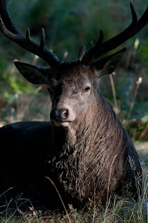
Taken a couple of weeks ago, this stag was resting in a copse of trees. I simply waited for the morning light to clear the foliage to the right and peep through a gap in the trees. This image would be far less effective with a lower contrast.


The high degree of contrast in this image helps to draw the eye to the buoy and then on to the reflection of it.


Exercise: Contrast and shadow fill

Without Diffuser
With Diffuser


No Diffuser, 1m Reflector
Diffuser, 1m Reflector


No Diffuser, 1/2m Reflector
Diffuser 1/2m Reflector


No Diffuser, Dull Foil Reflector
Diffuser, Dull Foil Reflector


No Diffuser, Shiny Foil Reflector
Diffuser, Shiny Foil Reflector


No Diffuser, Crumpled Foil Reflector
Diffuser, Crumpled Foil Reflector


In each instance here, the image containing the diffused light is better than the undiffused version. The foil paper added to the reflector made a significant difference, particularly with regard to bringing out the detail on that side of the image.

Looking at the images from the textbook was quite revealing. In the Alfred Stieglitz portrait of Dorothy Norman the deeper shadows frame the subject and the lighter shadows on the face add modelling, giving the image nice depth. Lightening the shadows could possibly introduce a slightly more fussy surround, detracting from the main subject of the picture. Without the shadows on the face you also might not be so drawn towards those mesmerising eyes.

In the Edward Weston portrait entitled Guadelupe Marin de Rivera, the deep shadows over the eyes combined with the open mouth and slightly raised head give the image a very powerful impact. Again, the face is framed perfectly by the shadows around the neck and into the head. Lightening these shadows would significantly reduce the passion portrayed in the image.


Exercise: Concentrating light

I left my garden gnome in situ as I thought it made quite an amusing subject for this particular exercise in the darkness of it's surrounds. I taped a cardboard tube, painted matt black inside, to a flash unit which was fired off camera quite close to the subject to produce this effect;


I'd like to experiment with multiple lights and coloured filters at some stage in the future, this has given me one or two ideas.


Exercise: Shiny surfaces

This was a very interesting exercise, if only for the fact that I was amazed how difficult it is to find something shiny in my house! I used a 105mm Macro lens for the close focus needed during this exercise.

Without Tracing Paper
With Tracing Paper


OK, a little work needed on the rather awkward composition of this engraved plate but the difference, achieved simply by curling a piece of tracing paper around the subject, is amazing! Interestingly, the wooden base of the trophy has been dulled somewhat.

Without Tracing Paper
With Tracing paper


Smartphones are notorious for glare interfering with your view of the screen. If only they all came with a tracing paper hood! I wanted to see how this technique worked with a glass-like surface. Very well it would seem.

Without Tracing Paper
With Tracing Paper


Finally I wanted a curved shiny surface. The original image is all shadow and highlight. The introduction of the humble tracing paper has produced a much more balanced result.


Making the best use of built in flash.

I have started to use this now, in the past I have disregarded it, to the point where the pop-up flash wouldn't pop up, it was stuck down through lack of use. I would originally just use it on full power without any thought.

Gundogs 


This image of Gundogs playing live is a perfect example. It is harsh, the bass player is overexposed and the atmospheric tungsten lighting has been swallowed up by it.


Now of course I have started to consider more carefully what I do with it.

Nomi Leonard
The image of Nomi Leonard was taken with the built in flash set to 1/128th power, barely a flicker. The tungsten lighting effect has not been lost but at the same time the face has been well lit and we have that rather nice catchlight which would otherwise have been lost. As a bonus, Nomi has not been blinded by a full power burst!


Dianne 

I had taken a shot of The Olympic Park at dusk and had the exposure in the camera. Placing Dianne in front of it would have resulted in a dark shadow of a person in the foreground. So for this shot I used the built-in flash at 1/50th power.


The built-in flash. It's my new best friend.