Picture 1 was taken with the undiffused light, picture 2 with the diffuser in place. For some reason the meter has decided that the shot taken with the diffuser in place has required a shorter shutter speed. The light on the diffused image appears to have been spread around much more evenly. The bright highlights on the undiffused image have been replaced by much more even tones throughout. The two significant shadows in the facial area appear much softer in Picture 2 with softer edges. Picture 1 seems to have been better exposed. This may be an anomaly with this particular subject setup, I will have to conduct a further experiment. Overall, at the moment I would say I like the colours of Picture 1 but prefer the consistency of the light in Picture 2
Exercise: The lighting angle
For this exercise I have changed the tungsten lamp I was using, firstly because it is easier to mave around the subject with it but mainly because it seems to "flicker" slightly less.
 |
| Front light |
|
 |
| Side light |
|
 |
| Edge light |
|
 |
| Rear light |
|
 |
| Front light at 45deg. |
|
 |
| Side light at 45deg. |
|
 |
| Edge light at 45deg. |
|
 |
| Rear light at 45deg. |
|
 |
| Overhead light |
|
 |
| Frontal overhead light |
|
 |
| Rear overhead light |
|
Obsevations regarding this set. My rear lighting hasn't worked out as planned. No silhouette effect, despite numerous experiments with exposure and lighting. Of the rear lit shots, the overhead example probably best demonstrates the outline of the subject. The differences between the lighting examples are quite extreme in some instances. The standout image for me is the one taken with frontal lighting pointed down at 45 degrees. This has lit the subject evenly as you would expect but the extra shadow, though slight has given the image much more depth and even an almost three dimensional quality.
Contrast
As I do very little indoor shooting apart from concert photography I thought it may be a little daunting to find high or low contrast shots in my collection. There are many however.

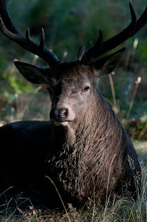
Taken a couple of weeks ago, this stag was resting in a copse of trees. I simply waited for the morning light to clear the foliage to the right and peep through a gap in the trees. This image would be far less effective with a lower contrast.
The high degree of contrast in this image helps to draw the eye to the buoy and then on to the reflection of it.
Exercise: Contrast and shadow fill
 |
| Without Diffuser |
|
 |
| With Diffuser |
|
 |
| No Diffuser, 1m Reflector |
|
 |
| Diffuser, 1m Reflector |
|
 |
| No Diffuser, 1/2m Reflector |
|
 |
| Diffuser 1/2m Reflector |
|
 |
| No Diffuser, Dull Foil Reflector |
|
 |
| Diffuser, Dull Foil Reflector |
|
 |
| No Diffuser, Shiny Foil Reflector |
|
 |
| Diffuser, Shiny Foil Reflector |
|
 |
| No Diffuser, Crumpled Foil Reflector |
|
 |
| Diffuser, Crumpled Foil Reflector |
|
In each instance here, the image containing the diffused light is better than the undiffused version. The foil paper added to the reflector made a significant difference, particularly with regard to bringing out the detail on that side of the image.
Looking at the images from the textbook was quite revealing. In the Alfred Stieglitz portrait of Dorothy Norman the deeper shadows frame the subject and the lighter shadows on the face add modelling, giving the image nice depth. Lightening the shadows could possibly introduce a slightly more fussy surround, detracting from the main subject of the picture. Without the shadows on the face you also might not be so drawn towards those mesmerising eyes.
In the Edward Weston portrait entitled Guadelupe Marin de Rivera, the deep shadows over the eyes combined with the open mouth and slightly raised head give the image a very powerful impact. Again, the face is framed perfectly by the shadows around the neck and into the head. Lightening these shadows would significantly reduce the passion portrayed in the image.
Exercise: Concentrating light
I left my garden gnome in situ as I thought it made quite an amusing subject for this particular exercise in the darkness of it's surrounds. I taped a cardboard tube, painted matt black inside, to a flash unit which was fired off camera quite close to the subject to produce this effect;
I'd like to experiment with multiple lights and coloured filters at some stage in the future, this has given me one or two ideas.
Exercise: Shiny surfaces
This was a very interesting exercise, if only for the fact that I was amazed how difficult it is to find something shiny in my house! I used a 105mm Macro lens for the close focus needed during this exercise.
 |
| Without Tracing Paper |
|
 |
| With Tracing Paper |
|
OK, a little work needed on the rather awkward composition of this engraved plate but the difference, achieved simply by curling a piece of tracing paper around the subject, is amazing! Interestingly, the wooden base of the trophy has been dulled somewhat.
 |
| Without Tracing Paper |
|
 |
| With Tracing paper |
|
Smartphones are notorious for glare interfering with your view of the screen. If only they all came with a tracing paper hood! I wanted to see how this technique worked with a glass-like surface. Very well it would seem.
 |
| Without Tracing Paper |
|
 |
| With Tracing Paper |
|
Finally I wanted a curved shiny surface. The original image is all shadow and highlight. The introduction of the humble tracing paper has produced a much more balanced result.
Making the best use of built in flash.
I have started to use this now, in the past I have disregarded it, to the point where the pop-up flash wouldn't pop up, it was stuck down through lack of use. I would originally just use it on full power without any thought.
 |
| Gundogs | |
This image of Gundogs playing live is a perfect example. It is harsh, the bass player is overexposed and the atmospheric tungsten lighting has been swallowed up by it.
Now of course I have started to consider more carefully what I do with it.
 |
| Nomi Leonard |
|
The image of Nomi Leonard was taken with the built in flash set to 1/128th power, barely a flicker. The tungsten lighting effect has not been lost but at the same time the face has been well lit and we have that rather nice catchlight which would otherwise have been lost. As a bonus, Nomi has not been blinded by a full power burst!
 |
| Dianne | |
I had taken a shot of The Olympic Park at dusk and had the exposure in the camera. Placing Dianne in front of it would have resulted in a dark shadow of a person in the foreground. So for this shot I used the built-in flash at 1/50th power.
The built-in flash. It's my new best friend.


 Taken a couple of weeks ago, this stag was resting in a copse of trees. I simply waited for the morning light to clear the foliage to the right and peep through a gap in the trees. This image would be far less effective with a lower contrast.


 Taken a couple of weeks ago, this stag was resting in a copse of trees. I simply waited for the morning light to clear the foliage to the right and peep through a gap in the trees. This image would be far less effective with a lower contrast.


No comments:
Post a Comment